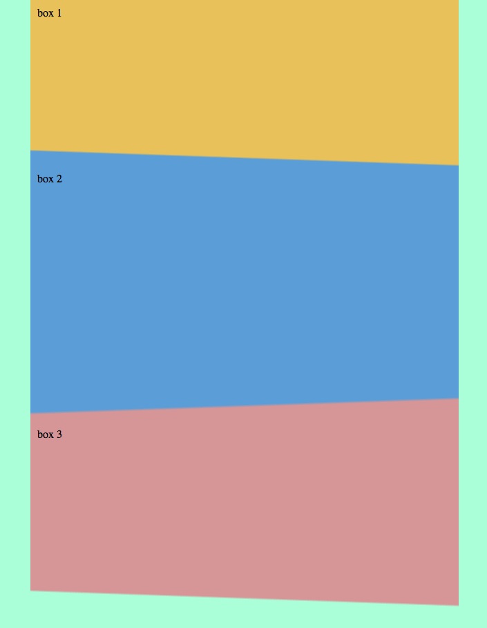
Heute ein kleiner CSS3-Test mit Gradients… Natürlich haben wir bereits Gradients verwendet, aber noch nie in unterschiedlicher Abschrägung zueinander, was einem ziemlichen coolen Effekt gibt…
Das Beispiel von dem Screenshots sieht im Source aktuell wie folgt aus:
[sourcecode language=“html“]
<html>
<head>
<style>
body{
background: #b5ffd6;
margin: 0px;
padding: 0px;
}
.box1 {
background: #e4c14d;
background: -moz-linear-gradient(2deg, #e4c14d 0%, #e4c14d 91%, #659dda 92%, #659dda 100%);
background: -webkit-gradient(linear, left top, right bottom, color-stop(0%,#e4c14d), color-stop(91%,#e4c14d), color-stop(92%,#659dda), color-stop(100%,#659dda));
background: -webkit-linear-gradient(2deg, #e4c14d 0%,#e4c14d 91%,#659dda 92%,#659dda 100%);
background: -o-linear-gradient(2deg, #e4c14d 0%,#e4c14d 91%,#659dda 92%,#659dda 100%);
background: -ms-linear-gradient(2deg, #e4c14d 0%,#e4c14d 91%,#659dda 92%,#659dda 100%);
background: linear-gradient(182deg, #e4c14d 0%,#e4c14d 91%,#659dda 92%,#659dda 100%);
filter: progid:DXImageTransform.Microsoft.gradient( startColorstr=’#e4c14d‘, endColorstr=’#659dda‘,GradientType=1 );
height: 220px;
margin:0 auto;
padding: 10px;
width: auto;
max-width: 600px;
}
.box2 {
background: #e4c14d;
background: -moz-linear-gradient(-2deg, #659dda 0%, #659dda 91%, #D19697 92%, #D19697 100%);
background: -webkit-gradient(linear, left top, right bottom, color-stop(0%,#659dda), color-stop(91%,##659dda), color-stop(92%,#D19697), color-stop(100%,#D19697));
background: -webkit-linear-gradient(-2deg, #659dda 0%,#659dda 91%,#D19697 92%,#D19697 100%);
background: -o-linear-gradient(-2deg, #659dda 0%,#659dda 91%,#D19697 92%,#D19697 100%);
background: -ms-linear-gradient(-2deg, #659dda 0%,#659dda 91%,#D19697 92%,#D19697 100%);
background: linear-gradient(178deg, #659dda 0%,#659dda 91%,#D19697 92%,#D19697 100%);
filter: progid:DXImageTransform.Microsoft.gradient( startColorstr=’#659dda‘, endColorstr=’#D19697′,GradientType=1 );
height: 350px;
margin:0 auto;
padding: 10px;
width: auto;
max-width: 600px;
}
.box3 {
background: #D19697;
background: -moz-linear-gradient(2deg, #D19697 0%, #D19697 91%, #b5ffd6 92%, #b5ffd6 100%);
background: -webkit-gradient(linear, left top, right bottom, color-stop(0%,#e4c14d), color-stop(91%,#e4c14d), color-stop(92%,#b5ffd6), color-stop(100%,#b5ffd6));
background: -webkit-linear-gradient(2deg, #D19697 0%,#D19697 91%,#b5ffd6 92%,#b5ffd6 100%);
background: -o-linear-gradient(2deg, #D19697 0%,#D19697 91%,#b5ffd6 92%,#b5ffd6 100%);
background: -ms-linear-gradient(2deg, #D19697 0%,#D19697 91%,#b5ffd6 92%,#b5ffd6 100%);
background: linear-gradient(182deg, #D19697 0%,#D19697 91%,#b5ffd6 92%,#b5ffd6 100%);
filter: progid:DXImageTransform.Microsoft.gradient( startColorstr=’#D19697′, endColorstr=’#b5ffd6′,GradientType=1 );
height: 250px;
margin:0 auto;
padding: 10px;
width: auto;
max-width: 600px;
}
</style>
</head>
<body>
<div class="boxall">
<div class="box1">
box 1
</div>
<div class="box2">
box 2
</div>
<div class="box3">
box 3
</div>
</div>
</body>
</html>
[/sourcecode]
Muss vermutlich noch etwas fine-ge-tuned werden, aber grundsätzlich bin ich für einen quick-test damit schon ganz zufrieden…